 As you can see I was trying to make it seem spherical with shading ones side darker and one side lighter. Problem I came across was the fact that I ended up getting darker area's where I tried adding more charcoal as it was fading. Anyways that's today's HP I hope that I can get some better drawings up for you soon and till next post I'll see ya'll later.
Tuesday, February 28, 2017
HP of the day.... * weakly *
Hey guys and welcome to another HP of the day. If the title wasn't clear I am posting an HP today but I am feeling a bit weak and I think I may have a stomach virus ( Maybe ) but it's alright. I don't want to go into detail but just know that because there were no HP's yesterday and today is a day I post HP's I decided that despite having not anything good to show I'd at least post something art related made by me cause that is what this blog is about. The " practice " I am going to post today is one of those ones that don't need commentary but that doesn't mean you can't post comments it just means that I wasn't trying to improve that much but rather get the feel of some new supplies I bought yesterday. So I had a little bit of cash and at Wal-Mart and thought about buying some art supplies and the first thing that came in mind were " softer pencils " that an artist friend suggested I try for shading. I bought these " softer pencils " or at least my best guess at what they were no " softer pencils " on the shelves so I got charcoal pencils for like $4 dollars and I have no idea how to use them so I decided to try and get the feel with them for shading and oh boy did that end in a messy way.
 As you can see I was trying to make it seem spherical with shading ones side darker and one side lighter. Problem I came across was the fact that I ended up getting darker area's where I tried adding more charcoal as it was fading. Anyways that's today's HP I hope that I can get some better drawings up for you soon and till next post I'll see ya'll later.
As you can see I was trying to make it seem spherical with shading ones side darker and one side lighter. Problem I came across was the fact that I ended up getting darker area's where I tried adding more charcoal as it was fading. Anyways that's today's HP I hope that I can get some better drawings up for you soon and till next post I'll see ya'll later.Monday, February 27, 2017
No HP for today

Hello and sorry about not posting any HP's ( except if you count the picture of my " Swag " * sarcastic * glasses ) but yesterday I was quite busy and because I wanted to finish the work I was doing I was left trying to rush for today and got some really bad stuff so sorry but sometimes these things happen even under my best attempts to get things done as well and fast as possible. Hope that the news doesn't bring down the 20 people who read this blog but I will do my best to get something for you tomorrow. That being said I am going to work on my DeviantArt account a little bit as I just got it up yesterday cause of losing passwords and stuff >-< so be sure to check that out. Till next post I'll see ya'll later!
Saturday, February 25, 2017
Welcome to DeviantArt: 5
Hello and welcome to another post of LLG and hope you guys are having a wonderful Saturday! For those of you who don't know, on Saturday's I get the worst and best HP of the week and compare them to artist who know what they're doing a lot better than me and try and see how I can improve by seeing what the artist do to make better art. I don't claim ownership of any of the pics listed and I will leave the creator's names in the post. Without further ado lets get started! For the worst HP of the week we have the Photoshop practice with a capped person. This was a follow up piece to the other

 is being shown because of that. Anyways for comparing I noticed that obviously they spent more time on this work and they used an angled shot rather than the profile I was going for. Next their lines are focused and not shaky in anyway, shape or form. Lastly they used their lighting in a very skilled way by having the light source come from the right and the shadow of the cap is angled because of this. So with the worst out of the way let us move onto the best.
 For the best I was going to choose the completed version of a character I did ( Mon) which could make for a good analyses as I have been working on that artwork for quite awhile but I have already had him pop up several times and his sketch made it into last weeks best I think so I decided against it. This sketch is one I did before another which the later one was made into the digital work I posted that got worst HP of the week but I do think this one is great. For this piece I was going for an angled shot that would cover the eyes and to make the shadows more prevalent on the right side with the thicker lines and shadows.
 This cap reference by by randychen is very similar to what I was going for without said shadows and covering of

sketch I did of a capped person. Now I know it is really bad and I shouldn't try and use an excuse but I have been working on Illustrator quite a bit lately with the pen tool and when I got to Photoshop with the brush tool and mouse my hand was shakier than before. Enough of that though and let's check out the comparison. This drawing by by Tal-Blaiser was a bit
suggestive and only the top part
is being shown because of that. Anyways for comparing I noticed that obviously they spent more time on this work and they used an angled shot rather than the profile I was going for. Next their lines are focused and not shaky in anyway, shape or form. Lastly they used their lighting in a very skilled way by having the light source come from the right and the shadow of the cap is angled because of this. So with the worst out of the way let us move onto the best. For the best I was going to choose the completed version of a character I did ( Mon) which could make for a good analyses as I have been working on that artwork for quite awhile but I have already had him pop up several times and his sketch made it into last weeks best I think so I decided against it. This sketch is one I did before another which the later one was made into the digital work I posted that got worst HP of the week but I do think this one is great. For this piece I was going for an angled shot that would cover the eyes and to make the shadows more prevalent on the right side with the thicker lines and shadows. This cap reference by by randychen is very similar to what I was going for without said shadows and covering of
the eyes. The main thing I noticed when drawing the cap on the HP was the fact that the hat
itself looked a bit off and I can see how this person did it so it looks normal which I think is
the main thing that I need to work on. I hope you enjoyed today's episode of WTDA and that
you would show it to any of your friends who may be good art critics as that is what this blog
really needs. Till next post I'll see ya'll later!
Thursday, February 23, 2017
HP: Update on Cereal Project
Hello and welcome to another post of LLG! Today's HP is gonna be a bit straight forward so I won't just talk about the HP but rather what plans I have and as always I'm going to ask the seven people that read this blog to please share it with their friends as I've done just about everything to try and get this blog out there and would like for people to try and help me out become better as I would like to make a great comic series out there on sites like Webtoons and Tapastic but I need to improve my art style and while drawing every day is good practice I would prefer to have help from the viewers of this blog to give their feedback. Now I no that may annoy some of you guys but I work really hard to write this blog in order to get better and I would really like to have you guys help me. Enough of just talking let's get today's HP done!
 This is the complete basic digital coloring of a character ( Mon) who is the mascot for a project I am working on. For this artwork I did have enormous trouble with the hands and some of the stripes on the suit could have been better but other than I am pretty pleased with this finished product. For this I first sketched the character on my sketchbook. After that I snapped a pic on my phone to then send it to my computer through Google Drive. After moving the image to Illustrator I proceeded to use the pen tool to make just about every piece except the buttons on the clothes which was done with the circle tool. Lastly after making the all the lines a live paint group I began coloring the whole piece. So now that I have finished all of that I am going to move this piece to Photoshop in order to place it on my cereal box and add any shading if I feel like it is beneficiary to the whole project. After all and all was done I got so used to the pen tool that when I went to Photoshop the other day with the brush tool I was super shaky but hopefully after a bit of reusing it I'll be able to steady my hand or maybe someday I'll get a drawing tablet but that won't happen till I could get money but that's not happening anytime soon. Well that concludes today's HP for today. I hope you enjoyed it and till next post I'll see ya'll next post!
This is the complete basic digital coloring of a character ( Mon) who is the mascot for a project I am working on. For this artwork I did have enormous trouble with the hands and some of the stripes on the suit could have been better but other than I am pretty pleased with this finished product. For this I first sketched the character on my sketchbook. After that I snapped a pic on my phone to then send it to my computer through Google Drive. After moving the image to Illustrator I proceeded to use the pen tool to make just about every piece except the buttons on the clothes which was done with the circle tool. Lastly after making the all the lines a live paint group I began coloring the whole piece. So now that I have finished all of that I am going to move this piece to Photoshop in order to place it on my cereal box and add any shading if I feel like it is beneficiary to the whole project. After all and all was done I got so used to the pen tool that when I went to Photoshop the other day with the brush tool I was super shaky but hopefully after a bit of reusing it I'll be able to steady my hand or maybe someday I'll get a drawing tablet but that won't happen till I could get money but that's not happening anytime soon. Well that concludes today's HP for today. I hope you enjoyed it and till next post I'll see ya'll next post! Wednesday, February 22, 2017
HP of the day and future comic series?!
Hello guys and welcome to another post of LLG! Today if the tittle was not clear I have an announcement to make. But before that I'd like to start with the HP so expect more details right after and sort of during the HP.
 For this HP I'm practicing a bit with photoshop and as you can see it is pretty much crap at the moment as I have not used photoshop and the mouse very often as I've been using Illustrator and the pen tool so my hand is shakier than usual which is saying something.... The anatomy, lines, depth and etc. is ehhhhhhhhhh...... anyways, I was going into today's blog and working on the HP thinking, " Wow, today's blog post is gonna be really cool, " but....we all know how that went. Anyways, hopefully by the end of March or sooner I'll start posting a comic series that I have gotten most of the ideas together but some are still under thought and of course there's the obvious that my art is ok at best at the moment but by another month or less it should be ok on a regular bases. Anyways...end of the post...see ya'll next post...hope its better tomorrow >-<.
For this HP I'm practicing a bit with photoshop and as you can see it is pretty much crap at the moment as I have not used photoshop and the mouse very often as I've been using Illustrator and the pen tool so my hand is shakier than usual which is saying something.... The anatomy, lines, depth and etc. is ehhhhhhhhhh...... anyways, I was going into today's blog and working on the HP thinking, " Wow, today's blog post is gonna be really cool, " but....we all know how that went. Anyways, hopefully by the end of March or sooner I'll start posting a comic series that I have gotten most of the ideas together but some are still under thought and of course there's the obvious that my art is ok at best at the moment but by another month or less it should be ok on a regular bases. Anyways...end of the post...see ya'll next post...hope its better tomorrow >-<. Tuesday, February 21, 2017
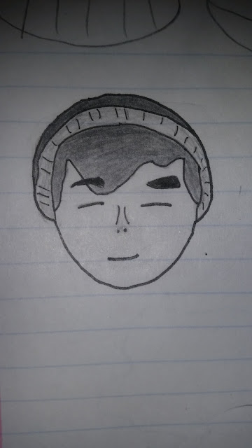
HP of the day.
Hello and welcome to the HP of the day! An HP is a picture drawn by me everyday as I practice in order to become a better artist and I post on this blog and sometimes other sites in order to get feedback from people from the internet who know more about art then I do. That being said let us start with today's HP!
 This is a drawing I did today on my sketchbook and used several tools to draw. Surprisingly while I did get the idea from seeing myself in the mirror with a cap that covered my face with it's shadow, I did not use a picture or stare in the mirror in order to draw this but it did it from the memory of it. I feel that me saying that has shown how far I've gotten from where I first started a few months ago and also explains how the hat is a little funky >-<. Now onto the tools I used and the process I did to draw this. First of I started with the hat as I wanted to use it as my focus point on how should the head be angled. I then continued to use my .9 mm pencil to sketch out majority of the head, face and shading. Next I added the details on the hat with my .7 mm pencil as the details were very small and hard if not impossible with my larger pencil. Lastly I used my Sakura illustration pens to bring out the outlines of the sketch. After all that was done I decided that the shade on the face from the hat was better with pencil as I felt using ink would make it look like the hat was extending. I hope that all the details I've added about this drawing has been able to explain my process so that anyone who is reading this may understand how I do things and take note of things I'm doing wrong. Should you find some advice you feel would help please let me know by either commenting on this post or by using any of the ways to contact me under the " contact me " page. Till next time I'll see ya'll later!
This is a drawing I did today on my sketchbook and used several tools to draw. Surprisingly while I did get the idea from seeing myself in the mirror with a cap that covered my face with it's shadow, I did not use a picture or stare in the mirror in order to draw this but it did it from the memory of it. I feel that me saying that has shown how far I've gotten from where I first started a few months ago and also explains how the hat is a little funky >-<. Now onto the tools I used and the process I did to draw this. First of I started with the hat as I wanted to use it as my focus point on how should the head be angled. I then continued to use my .9 mm pencil to sketch out majority of the head, face and shading. Next I added the details on the hat with my .7 mm pencil as the details were very small and hard if not impossible with my larger pencil. Lastly I used my Sakura illustration pens to bring out the outlines of the sketch. After all that was done I decided that the shade on the face from the hat was better with pencil as I felt using ink would make it look like the hat was extending. I hope that all the details I've added about this drawing has been able to explain my process so that anyone who is reading this may understand how I do things and take note of things I'm doing wrong. Should you find some advice you feel would help please let me know by either commenting on this post or by using any of the ways to contact me under the " contact me " page. Till next time I'll see ya'll later!Monday, February 20, 2017
Multi Monday HP
Hello and welcome to another post in LLG. For those who are new to this blog and don't know what is going on in this post it is quite simple. Every day except Friday, Saturday and Sunday I post pictures of things I draw and I ask you as the viewer to comment to how I can improve cause I do want to become a better artist and I have been doing this since the beginning of this year and while there have been exactly 1 comment that has given me advice on how to improve I have improved just by practicing everyday and while I still suck I am less sucky then I have ever been! ^-^ That being said I forgot to mention that on Monday's I post two HP's to make up for none over the weekend. Without further ado let's get right into the thick of things!
 This first pic is my progress with a project I've started and if you don't remember ( or just weren't there ) I've already shown the sketched version of this pic as I did do that first in order to work out the basic line work and details without color or refinement. Now, for this pic I am using the software Adobe Illustrator as I want it to be a vector graphic piece as it will be part of a design I am working on. If your new it'll also be worth noting that any digital art work is done on a adobe software like Illustrator or Photoshop but sometimes I use Auto Desk Sketchbook.
 This next pic is a little experiment I did on " dot shading " ( name I came up with as I don't know the real term) and in my eyes is kinda a fail >-<. For this piece I sketched out the lines where the shadows and dunes would be. I then proceeded to try and use dotting the darker areas more heavily while lightly dotting the lighter areas. Lastly unlike most of my drawings I used only pencil and did not ink it. With that today's multi HP comes to a close. I do hope you enjoyed it and that you may give me some advice for improvement. I'll see ya'll in tomorrow's post so later!
This first pic is my progress with a project I've started and if you don't remember ( or just weren't there ) I've already shown the sketched version of this pic as I did do that first in order to work out the basic line work and details without color or refinement. Now, for this pic I am using the software Adobe Illustrator as I want it to be a vector graphic piece as it will be part of a design I am working on. If your new it'll also be worth noting that any digital art work is done on a adobe software like Illustrator or Photoshop but sometimes I use Auto Desk Sketchbook. This next pic is a little experiment I did on " dot shading " ( name I came up with as I don't know the real term) and in my eyes is kinda a fail >-<. For this piece I sketched out the lines where the shadows and dunes would be. I then proceeded to try and use dotting the darker areas more heavily while lightly dotting the lighter areas. Lastly unlike most of my drawings I used only pencil and did not ink it. With that today's multi HP comes to a close. I do hope you enjoyed it and that you may give me some advice for improvement. I'll see ya'll in tomorrow's post so later!Saturday, February 18, 2017
Welcome to DeviantArt
Hello and welcome to another post of LLG and today is the day when I make my WDA post. This is a post where I will compare art from more established artist to my own drawings. With that lets get started! First as if almost by tradition we'll start of with the worst HP of the week.
 This HP from Monday I believe isn't even finished and awkward. It was just a quick and lazy practice at anatomy with people in real life poses.
 This is a picture by by ilolamai quite similar in position to the one I did myself. Now on terms of style or just about everything else it is very different. Honestly I think that with a bit more effort and time I could have done better for that drawing but as I said it was just a simple practice. Moving on to the next pic which is the best HP of the week is one that I am very proud of.
 This drawing is a character design I am doing for a project and is based on old time cartoons with his glove hands, simple eyes and more laxed on anatomy. I know it has its flaws and while I did put much more effort into this piece it isn't full effort as I did get lazy with some of the strips and the hands ( especially with the left one).
This HP from Monday I believe isn't even finished and awkward. It was just a quick and lazy practice at anatomy with people in real life poses. This is a picture by by ilolamai quite similar in position to the one I did myself. Now on terms of style or just about everything else it is very different. Honestly I think that with a bit more effort and time I could have done better for that drawing but as I said it was just a simple practice. Moving on to the next pic which is the best HP of the week is one that I am very proud of. This drawing is a character design I am doing for a project and is based on old time cartoons with his glove hands, simple eyes and more laxed on anatomy. I know it has its flaws and while I did put much more effort into this piece it isn't full effort as I did get lazy with some of the strips and the hands ( especially with the left one).  This picture by
with the most obvious being that the left hand is facing the appropriate way and the less
obvious being that SuperLakitu made the character more round instead of rigid. With that
that concludes today's post. I hope you enjoyed it and can't wait to see ya'll next post.
Thursday, February 16, 2017
HP of the Day
Hello reader and welcome to another HP for you guys to comment on and enjoy. Now before we start I'd like to refer you guys to my bio page as it does give some better insight on why it is I do the things I do and is important to today's HP. You see one of the jobs I hope to land is a graphic designer. It is a humble job compared to my bigger hopes of a game designer or animator but it is one where my love for thinking outside the box can still be used. That being said I have done some work practice and even one for pay for companies. Now, from my class for graphic design and illustration I've been given a very common project I like to call, " The Cereal Project ". This is a project where I have to design a box for a cereal company. I just started and I don't want to go into much detail as this is a blog and post about the art, not the naming or other stuff ( but I may bring those up in later post). So with that being said I have made a mascot for the cereal and the sketch I have done I consider one of if not my best yet! ^-^
 This is my second drawing I've shown on this site that is on my sketch book and I feel proud of it! ^-^ It isn't the best drawing out there I know and I know I got a bit ( understatement ) lazy with the hands but as a whole I feel like it feels like a completely new character and has some personality in it. Enough of me feeling proud though lets talk about " his " design. You see Mon ( name of character which is also written above him ) is meant to be based off old cartoons with his suit, eyes, gloves and hat. I had quite a lot of fun drawing this character as old cartoons didn't focus on anatomy as much as we do today so having a small neck with a big head followed by long unboned arms doesn't make it look weird but rather gives it the old time style. I used pictures from a quick google image search of suits in order to draw that and the same goes for the hat. Lastly in order for me to be able to color the hair and be able to see the eyes clearly I had to ink them with my Sakura brand art pens as his right eye is slightly covered by his hair. With that I'll be continuing to work on this piece and so expect him again soon. Till next post I'll see ya'll later!
This is my second drawing I've shown on this site that is on my sketch book and I feel proud of it! ^-^ It isn't the best drawing out there I know and I know I got a bit ( understatement ) lazy with the hands but as a whole I feel like it feels like a completely new character and has some personality in it. Enough of me feeling proud though lets talk about " his " design. You see Mon ( name of character which is also written above him ) is meant to be based off old cartoons with his suit, eyes, gloves and hat. I had quite a lot of fun drawing this character as old cartoons didn't focus on anatomy as much as we do today so having a small neck with a big head followed by long unboned arms doesn't make it look weird but rather gives it the old time style. I used pictures from a quick google image search of suits in order to draw that and the same goes for the hat. Lastly in order for me to be able to color the hair and be able to see the eyes clearly I had to ink them with my Sakura brand art pens as his right eye is slightly covered by his hair. With that I'll be continuing to work on this piece and so expect him again soon. Till next post I'll see ya'll later!Wednesday, February 15, 2017
HP of the day
Hello and welcome to another HP of the day on LLG. I know I didn't post yesterday but that is because I was taking a break for the holiday. Why did I not say anything? well I was really exhausted for some reason and it could be that I was being overcelebrational ( made up word ) but I decided to take a break and you guys deserve a break from all the bad art so it was a win win. But today we are coming back with a vengeance and by we I mean You guys as I'm posting an old ( ok ) drawing that I like so I can focus on the content I'm working on right now. The reason there isn't any new drawings is because lately I've been having trouble on figuring out what to draw and staying on it. I come up with an idea, work on it for like 5 minutes and end up doing something else. So sorry about all the lagging behind but I will try my best to keep updating because making art ( even if its bad ) is a great way for me to motivate me to draw consistently even though I don't draw if I don't feel like it ( I'm pushing myself but not forcing myself if that makes any sense). Enough with the rambling though and lets get started!
 This is one of the first drawings in my notebook of me trying to practice perspective on a setting. I used the building doors as the " vanishing point " and mainly use the sidewalk for the " perspective stuff " ( see how great my vocabulary at times). This was a very simple drawing as I did not use any of my illustrator pens but rather just my pencil and regular pens. It's been awhile so I can't say what pens I did use so yeah...I hope you guys did enjoy this and make sure to comment or follow( comment to give me tips and follow to know when I post ). Till next post I'll see ya'll later.
This is one of the first drawings in my notebook of me trying to practice perspective on a setting. I used the building doors as the " vanishing point " and mainly use the sidewalk for the " perspective stuff " ( see how great my vocabulary at times). This was a very simple drawing as I did not use any of my illustrator pens but rather just my pencil and regular pens. It's been awhile so I can't say what pens I did use so yeah...I hope you guys did enjoy this and make sure to comment or follow( comment to give me tips and follow to know when I post ). Till next post I'll see ya'll later. Monday, February 13, 2017
Double HP of Monday's!!!
Hello and welcome to another double HP of the day! If you don't know why there are two HP's rather than one it is because due to the schedule I have a good four days to make HP's for you. Why isn't four instead of two? cause I'm lazy that's why. SO LETS GET STARTED!
 For this first one I wanted to show off that I finally got my hands on a at home version of photoshop cs6 and I am loving it! Right now I'm working on coloring and refining this piece but I worked quickly to finish the basic outline and coloring to show you guys it.
 This next one is another not completely finished but it is just a little something I started in order to practice my anatomy skills of a person in a normal pose. With that that concludes today's HP. I know it was a short one and I am sorry. I'll try and get more quality post out soon and with my skills improving and with better equipment and software I may be able to start a series in like two months and I look forward to it! Till next post I'll see ya'll later.
 This next one is another not completely finished but it is just a little something I started in order to practice my anatomy skills of a person in a normal pose. With that that concludes today's HP. I know it was a short one and I am sorry. I'll try and get more quality post out soon and with my skills improving and with better equipment and software I may be able to start a series in like two months and I look forward to it! Till next post I'll see ya'll later.
Saturday, February 11, 2017
Welcome to DeviantArt episode 3
Hello and welcome to another post of LLG where we like to celebrate the passing of each week with a wonderful segment that is filled with effort and critic called Welcome to DeviantArt. If you do not know what this is it is a weekly segment on this blog where I get two the previous HP's of the week ( best and worst ) which are drawn completely by myself and compared them to a more established artist from the site DeviantArt as a means to compare the two and try to improve my own skills by seeing what a better artist does. With that being said lets jump right into things by starting off with the worst HP of the week.
 This weeks worst HP has to be the Japanese shrine style ramen shop.
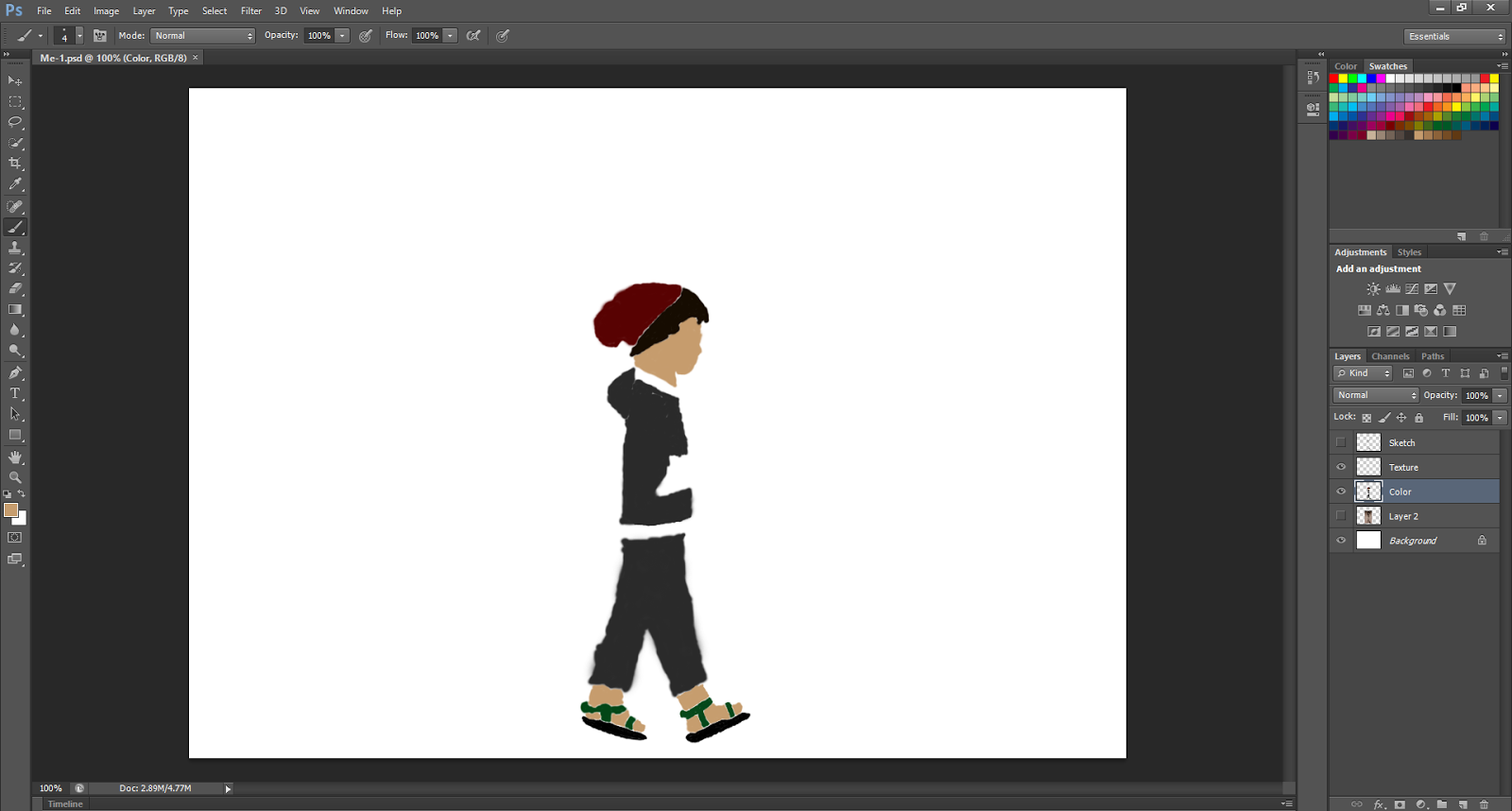
Taking a short look at what the Deviant user Joel-Lagerwall did I can see on a couple of hundred of things I did wrong. Before I start though I'd like to say that I did do the HP without references just with memory which is a big mistake. To begin with on my drawing I did not add any pillars and multiple " roof things " which would have worked better. I did my best but failed pretty badly on trying to add shading. Lastly While i wasn't going for the solid color walls like this drawing but rather the gridded one I could have made the white more dominant than the darker color. Moving onto the best HP of the week we are going to use the picture I made of myself walking.
 For this drawing I tried to draw what you would usually see if you came across me in real life with a little cartoon spin of course. Now what I wanted to focus on for this pic ( other than trying to make a full character with distinct clothes ) is the body placement.
This drawing by a user by the name of humon kinda shows what I was going for and other than being able to make folds of the clothes and having cleaner lines I'd say this is a pretty good match. So with that today's Welcome to DeviantArt episode comes to a close but fret not as with next Saturday comes a brand spanking new episode for your entertainment. I do hope you enjoyed it and till next post I'll see yall later.
This weeks worst HP has to be the Japanese shrine style ramen shop.  |
| by Joel-Lagerwall |
For this drawing I tried to draw what you would usually see if you came across me in real life with a little cartoon spin of course. Now what I wanted to focus on for this pic ( other than trying to make a full character with distinct clothes ) is the body placement. |
| by humon |
Thursday, February 9, 2017

Wednesday, February 8, 2017
HP of the Day
Hello and welcome to another post of LLG, today I have made a better HP than yesterday and I hope you do enjoy it. So without further ado lets get started!


Today I felt like making something weeb like so I tried drawing a Japanese style ramen shop based on not any real ramen shops but but rather on pictures of japanese style shrines for some reason * Nervous laugh*. Perhaps it is because I watched one of my favorite Studio Ghibli movie of "Spirited Away". Well, for this I wanted to focus on making some lines thicker to make the shadows more predominant and I experimented with different sizes on the window wood sizes ( the dark lines on besides the door thing). Lastly what wouldn't complete a weeb drawing without a poorly written japanese kanji for meat on it. For this whole drawing I used my Sakura illustrator pens to make majority of the lines and the graphic marker for the thicker lines such as the bottom of the roof and the shadowy side of the door curtain thing. The last tool I used is the Sakura Brush for the the meat kanji. I hope you guys liked it and have some comments on how I can improve. I know that most of the post seem a bit redundant as I usually use the same tools and make pictures that are very slowly improve. Till next post i'll see ya'll later.
Tuesday, February 7, 2017
HP of the day.
Hello and welcome to another HP of LLG. If you don't know what this is, it is where I post something I've drawn on this post and ask for you guys who read this blog to give me feedback on how to improve.
 Today's HP is a simple one and doesn't need much feedback as its just me practicing hands and feet and trying to learn new techniques. I just did this one with pencils and none of my inking pens which is why it is hard to see. I know it isn't the biggest drawing I've done and certainly not very appealing but today has been a very lazy day for me ( mood wise ) so stuff like this does happen. I hope that you enjoy this blog to which I would suggest not really paying this post too much attention as I didn't put much effort if any into but I do put a lot of effort and time into my other posts so be sure to check those out. Till next post I'll see you later.
Today's HP is a simple one and doesn't need much feedback as its just me practicing hands and feet and trying to learn new techniques. I just did this one with pencils and none of my inking pens which is why it is hard to see. I know it isn't the biggest drawing I've done and certainly not very appealing but today has been a very lazy day for me ( mood wise ) so stuff like this does happen. I hope that you enjoy this blog to which I would suggest not really paying this post too much attention as I didn't put much effort if any into but I do put a lot of effort and time into my other posts so be sure to check those out. Till next post I'll see you later.Monday, February 6, 2017
HP of the Day!!
Hello and welcome back to another post of LLG, this week I am not going to start off with a regular post but it will happen sometime. Today we are going to do the ever so common HP of the day post but as you guys know on Monday's I post two HP's rather than just one so lets get started.


For those of you who've read past post you would know that I did a cartoon character of myself but when I looked back to it and gave some thought into I realized my mistake. I didn't actually use me as reference which is why my new profile pic is what it is and why I made a new character version of me. I know it is a bit hard to tell but the picture is me and my chinese looking eyes ( not actually chinese but many people think that ), small nose, bushy eye brows and very thick fluffy hair. There are some other features I would like to add in the future ( like the scar I have under my my brow ( can't remember which side )) but I just wanted to get this done quick so I could use it for my profile pic. I also added a beanie as I do wear them a lot. For this pic I used my smooth shading for the shadow of the nose ( hard to see in pic I know ) and hat while using the lined shading on the hair. I the used my Sakura illustrator pens for the outlining of the pic and the graphic marker for the brows. Overall these is a pretty accurate drawing of me as I do find myself smiling a lot.

For the last picture I worked on an original character who I know looks a lot like the edgy teen from the newer " Horton Hears a Who" but trust me when I say that it was not my intention and I didn't realize till it was done. For this I wanted to mess around with different patterns on clothes rather than just solid colors and wanted to think of a creative shortcut on drawing the hands. By shortcut I mean completely covering them with the sleeve of the shirt except the fingers but I did it with the thought of old cartoons which to save production time and cost would cover the hands in gloves to not have to worry about detail. Also, for those of you who read yesterday's post and how I talked about how I liked how the drawing by others had the back slopped I did try and do the same thing here ( but this drawing was done before I wrote that episode). Lastly on the drawings description I did want to use a scarf but as you can probably tell I did do it after I inked the drawing itself so it doesn't look on the character and it is supposed to flow like him as it is a floating character. For this drawing all I used was my pencil for shading and my Sakura illustrator pens. With that today's HP's for the day come to a close. I hope you enjoyed the post and that you thought of some tips on how I can improve. Make sure to follow me here or on twitter to know exactly when I make a post for LLG. Till next post I'll see ya'll later.
Saturday, February 4, 2017
Welcome to Deviant Art episode 2
Hello and welcome again to another post of LLG and another episode of Welcome to Deviant Art episode! For those of you who don't know what this is it is a post I do every Saturday where I get the best and the worst HP of the week and compare them to artist on Deviant art who drew the same topic as me. All the names of the creators will be listed and this is for critic and research to improve my own style thus is under Fair Use. I do not claim to own any of the pictures other that the HP's so without further ado let's get started! First off i do like to start off with the worst and we'll start with the angry faced guy with a hood who didn't look as angry as he did with another facial expression.
 To start things off we got to first search up what it is I tried to draw.
 Sounds about right.
 While I think it isn't my best ( as a lot of my stuff ) I think it was the best this week and I can see it as being acceptable. So to begin our search we are just going to look up a facing away girl or something. As you would imagine finding such a specific drawing is hard and looking very hard I could only find characters standing up but that'll do.
To start things off we got to first search up what it is I tried to draw.Sounds about right.  |
| by Dyemelikeasunset |
Straight off the bat we find a picture of a way edgier person who looks more upset and better in a hood than my character. I think what I need to focus on in order to make better " edge lords " is to focus on more of the shape and expressions rather than the clothing and hair. To improve I need to get better with expressions. Next up for the best HP of the day would have to be the drawing I did when I tried challenging myself to draw someone that I saw in my day.
While I think it isn't my best ( as a lot of my stuff ) I think it was the best this week and I can see it as being acceptable. So to begin our search we are just going to look up a facing away girl or something. As you would imagine finding such a specific drawing is hard and looking very hard I could only find characters standing up but that'll do. |
| by madspartan013 |
Looking at this picture I can see how I could improve on things such as shading of the skin to the shape of the hair. I do like the artist from both artist ( not me ) make the characters lean a little back. I just think it looks really neat and both do well do to keep good anatomy while doing so. Well with that today's episode comes to a close but come back next week and there will be more HP'S to be compared in the next episode. If you don't want to miss it make sure to either click on the blue follow button on the web version of LLG or follow the blog on twitter where I post to let ya'll know what is going on and maybe ask questions from you guys to get ideas for future drawings and episodes. You can search up my twitter username which is LLGWriter for that. See you guys next post and don't forget to comment what you think.
Thursday, February 2, 2017
HP of the Day.
Hello and welcome to another HP of the day. So today not only do I have an HP for you today but I have some news that does need to be addressed today so lets start with that. First off for the news is the fact that this weekend I am going to be very busy. That being said it will effect how the Welcome to Deviant Art and Monday's double HP but they will be there still. Lastly for news if you have checked the Contact Me page you'd noticed that I'ved added a twitter username that you may use in order to contact me and for me to post things that deal with this blog. Now that that is out of the way lets move on to what you guys came for. Let's get started with the HP of the day!
 Today I tried to draw someone in a hood that was angry but he ended up looking like he was a little like he was caught doing a little " business" >-<. I tried using the smoothing of the pencil lead again for the hood and the sketchy look for the hair. I used my 08 Sakura pens on the outer, thicker lines and the 005 Artist's Loft pen on the eyes and mouth. Lastly for the shaded part of the inner hood I used my graphic marker for making a darker look on the inside. Well, that concludes today's HP. I hope that you guys enjoyed it and I look forward to seeing some comments on ways I can improve. Remember that if you want to make me try and draw something just comment on any post what you want or use any of the ways to contact me under the Contact Me page. Till next post I'll see ya'll later.
 Today I tried to draw someone in a hood that was angry but he ended up looking like he was a little like he was caught doing a little " business" >-<. I tried using the smoothing of the pencil lead again for the hood and the sketchy look for the hair. I used my 08 Sakura pens on the outer, thicker lines and the 005 Artist's Loft pen on the eyes and mouth. Lastly for the shaded part of the inner hood I used my graphic marker for making a darker look on the inside. Well, that concludes today's HP. I hope that you guys enjoyed it and I look forward to seeing some comments on ways I can improve. Remember that if you want to make me try and draw something just comment on any post what you want or use any of the ways to contact me under the Contact Me page. Till next post I'll see ya'll later.
Wednesday, February 1, 2017
Horrible Picture for you GUYS to rant about!!!!!!
Hello lovely audience that gives zero feedback and welcome to another post on this blog LLG. Today I'd like to also talk about the pens I use to ink a lot of the pictures you see and yeah. So without further ado lets get started!
 Today I tried challenging myself a bit with something that leaves normal artist unfazed I found out after I did it so I had like 10 minutes of high self esteem there * cries *. So, the challenge I set for me today was to draw a person that I saw in class while not asking them to stay still and so on. I tried my best to get the folds of the shirt?...sweater? whatever the thing that girls where that leaves the shoulders sticking out I don't know I also did my best to work with the hair slightly as most of you know my I don't do a lot of hair in my art but I am trying my best to learn how to work it. Next if you pay very close attention to the shading I did with the pencil on the hair and on the " shirt " they are different as the shirt I smudged to make it look smoother rather than the hair which kinda benefits in my opinion from the fibery look at the moment cause I know cartoons don't usually have that ( the main art style I am trying to achieve is of course cartoon as I've said in this blog before.). Lastly as many of my drawings have I outline them heavily with inking pens with outer lines being more bold especially in more shadowy areas while the details tend to have thinner. The only reason I do this is because I think it looks nice and I'm sure there is an art style that uses this technique but I can not call it off the top of my head and I try not to copy art styles as I want to make my own art style ( but time to time I will make exceptions for projects, highlights and of course for practice). Finally the last thing I would like to talk about are the inking pens I use that my " art style " ( if it can even be called that ) depends on. The reason I would like to talk about this is because if you've seen my older post I did a post on the stuff I use but I didn't have inking pens to show as I lost my old ones ( that I've had for years ) and didn't yet buy my new ones I use now. So, the pens I like the best and were my old ones ( and used in this drawing as I found them ^-^) are my Japanese imported Sakura brand Magna set! These are monsters of inking pens as I bought them in 2013 and with little use every single one of them work perfect. The set comes with multiple pens and a graphic and brush marker thing. I personally like using the brush and graphic for thicker more artsy lines in drawings and they look really well in the end. To buy this set you can go to any art store and purchase them at mainly $20 I believe. Lastly are the pen set I bought recently and while they aren't the monsters of Sakura they still are usefully as they get the job done with my other drawing. These are the Artist's Loft Illustration pens. They come with the standard pens so no fancy brush or graphic markers but they do have the same and more sizes of the Magna set. In the end, if interested you can buy these for around $9 and are great for people with little money to spare. Sorry about the long post and I do hope to see some comments below about some tips on how I can improve. Till next post I'll see ya'll later!
 Today I tried challenging myself a bit with something that leaves normal artist unfazed I found out after I did it so I had like 10 minutes of high self esteem there * cries *. So, the challenge I set for me today was to draw a person that I saw in class while not asking them to stay still and so on. I tried my best to get the folds of the shirt?...sweater? whatever the thing that girls where that leaves the shoulders sticking out I don't know I also did my best to work with the hair slightly as most of you know my I don't do a lot of hair in my art but I am trying my best to learn how to work it. Next if you pay very close attention to the shading I did with the pencil on the hair and on the " shirt " they are different as the shirt I smudged to make it look smoother rather than the hair which kinda benefits in my opinion from the fibery look at the moment cause I know cartoons don't usually have that ( the main art style I am trying to achieve is of course cartoon as I've said in this blog before.). Lastly as many of my drawings have I outline them heavily with inking pens with outer lines being more bold especially in more shadowy areas while the details tend to have thinner. The only reason I do this is because I think it looks nice and I'm sure there is an art style that uses this technique but I can not call it off the top of my head and I try not to copy art styles as I want to make my own art style ( but time to time I will make exceptions for projects, highlights and of course for practice). Finally the last thing I would like to talk about are the inking pens I use that my " art style " ( if it can even be called that ) depends on. The reason I would like to talk about this is because if you've seen my older post I did a post on the stuff I use but I didn't have inking pens to show as I lost my old ones ( that I've had for years ) and didn't yet buy my new ones I use now. So, the pens I like the best and were my old ones ( and used in this drawing as I found them ^-^) are my Japanese imported Sakura brand Magna set! These are monsters of inking pens as I bought them in 2013 and with little use every single one of them work perfect. The set comes with multiple pens and a graphic and brush marker thing. I personally like using the brush and graphic for thicker more artsy lines in drawings and they look really well in the end. To buy this set you can go to any art store and purchase them at mainly $20 I believe. Lastly are the pen set I bought recently and while they aren't the monsters of Sakura they still are usefully as they get the job done with my other drawing. These are the Artist's Loft Illustration pens. They come with the standard pens so no fancy brush or graphic markers but they do have the same and more sizes of the Magna set. In the end, if interested you can buy these for around $9 and are great for people with little money to spare. Sorry about the long post and I do hope to see some comments below about some tips on how I can improve. Till next post I'll see ya'll later!
Subscribe to:
Comments (Atom)